Please verify your subscription
Full access is free to subscribers. Limited access (no access to search or PDF features) is available for occasional users from outside our circulation area.
If you are not currently a subscriber, you may subscribe online to receive access to the site.
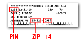
If you are a current print subscriber, your subscription mailing label is your passport. Find on your mailing label the numbers located in the positions shown on a sample below.
If you are an online subscriber, your numbers will have been provided to you in an email shortly after you subscribed. If you have lost your numbers, try our credential retrieval service or email us at circulation@marionrecord.com.
If you previously registered for this site, the numbers you used at that time will be pre-filled in the blanks at the bottom of this screen.
Carefully check or type your numbers into the verification form, then click SUBMIT to validate your subscription. Note that the numbers you formerly used may need to be updated. Please don't try to copy the numbers from the sample; they won't work.

© Hoch Publishing Co, Inc., 117 S. 3rd St., Marion, KS 66861-1621